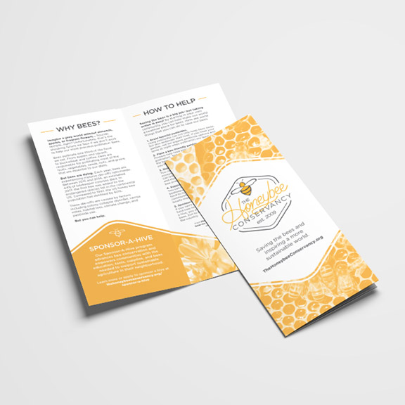
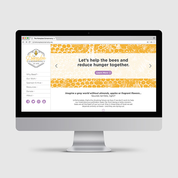
HONEYBEE CONSERVANCY REDESIGN
Redesign of an existing non-profit organization, including the logo, brochure, and website. The clean aesthetic of the new logo carries over to the brochure and website designs. The honeycomb shape provides a unique and eye-catching layout for the brochure, and the use of a primarily monotone color palette (with purple accents of color), helps keep the designs looking fresh and modern, yet sophisticated.